AD PLACEMENT
Winter Trends 2025–2026: 20 Nail Color Ideas That’ll Rule the Cold Season ❄️💅

AD PLACEMENT
Winter 2025–2026 is not about hiding in neutrals — it’s a season to let your nails do the talking. The shift is toward sophisticated contrasts: moody jewel tones, soft milky washes, and metallic accents that sparkle through frosty air. With fashion leaning into “quiet luxury” and subtle drama, your manicure becomes a refined statement. Whether you’re layering chunky knits or gliding through holiday soirées, the right nail shade can elevate your entire look.
This season calls for both boldness and restraint. Deep berries, smoky blues, and chocolatey browns speak to winter’s intensity, while sheer “soap nails,” latte neutrals, and whispery pastels keep things gentle and versatile. And don’t forget about texture — magnetic finishes, glassy sheens, and layered shimmer will transform simple colors into dazzling dimensions.
So, if you’re ready to give your manicure a cool-season makeover, scroll down for the 20 trending winter nail color ideas for 2025–2026. These aren’t just color swatches; they’re moods, mini-stories you wear at your fingertips. Use them as inspiration for your next mani appointment or DIY night. And yes — all are optimized to attract eyeballs (and likes) to your feed. Let’s dive in.
AD PLACEMENT
Best Winter Nail Colors
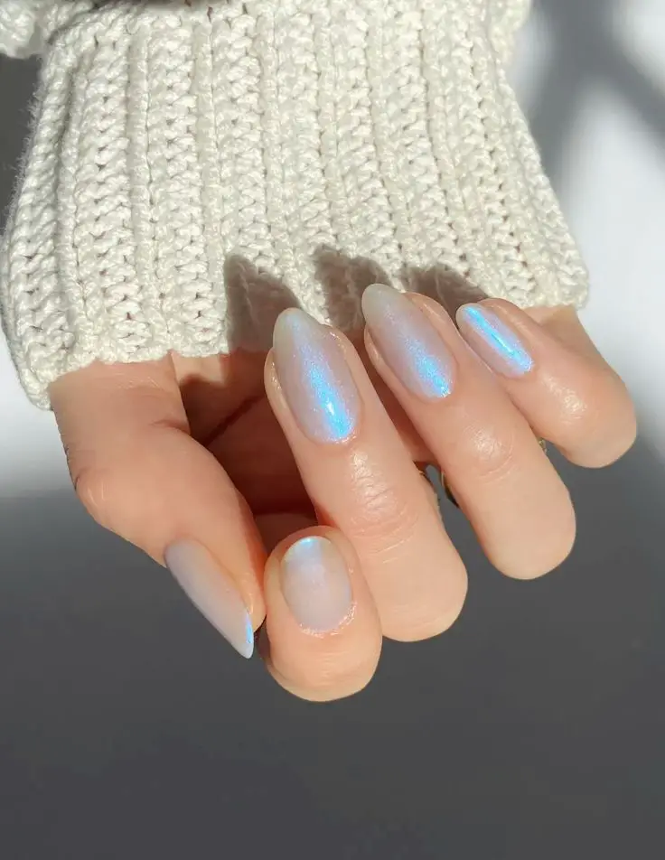
Iced Champagne (Magnetic Cat-Eye Glow)
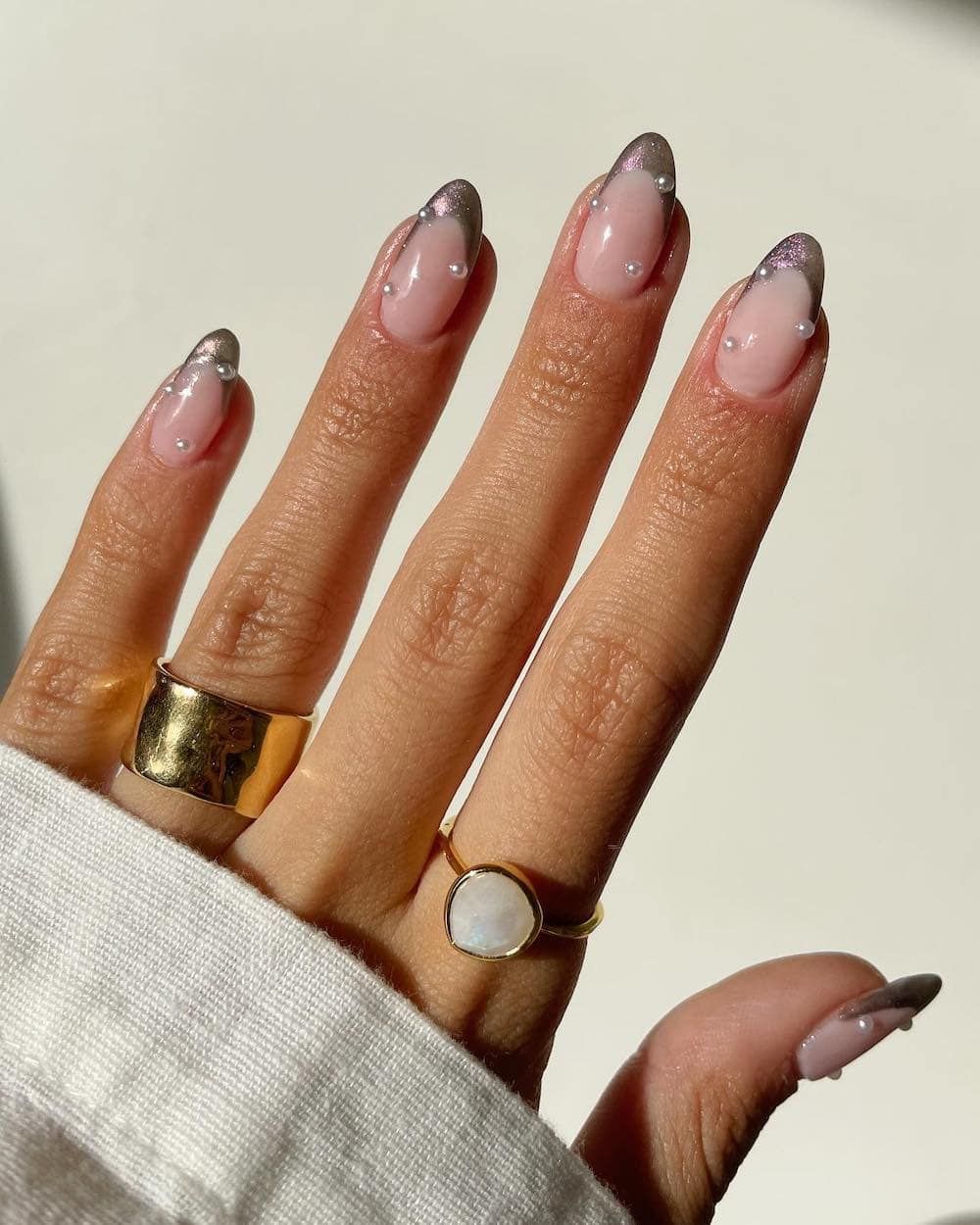
This shimmering tone blends soft gold, pearl, and light champagne with a magnetic cat-eye effect that shifts in light. Think of it as liquid sunlight caught under frost. Use a magnetic gel tool to guide a subtle “glow line” across the nail, giving dimension to a gentle metallic base. It’s perfect for festive gatherings or any moment when you want sparkle without overpowering your look.
Soft Pink Quartz
Pale pink with a dash of warmth and a subtle glow. Think of rose quartz in nail form: delicate but resilient. It’s flattering across skin tones and works beautifully as a base under minimalist art, fine lines, or metallic accent dots. It’s the kind of pink that reads professional and pretty.
AD PLACEMENT
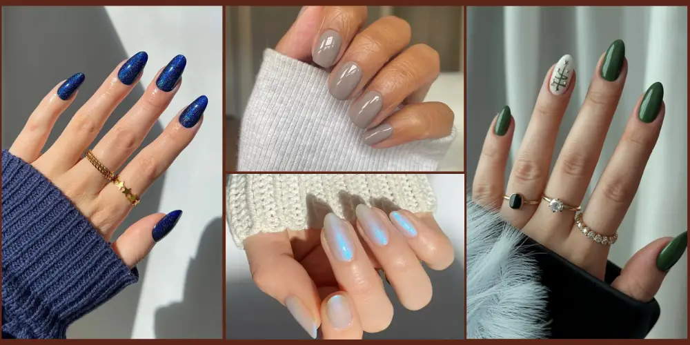
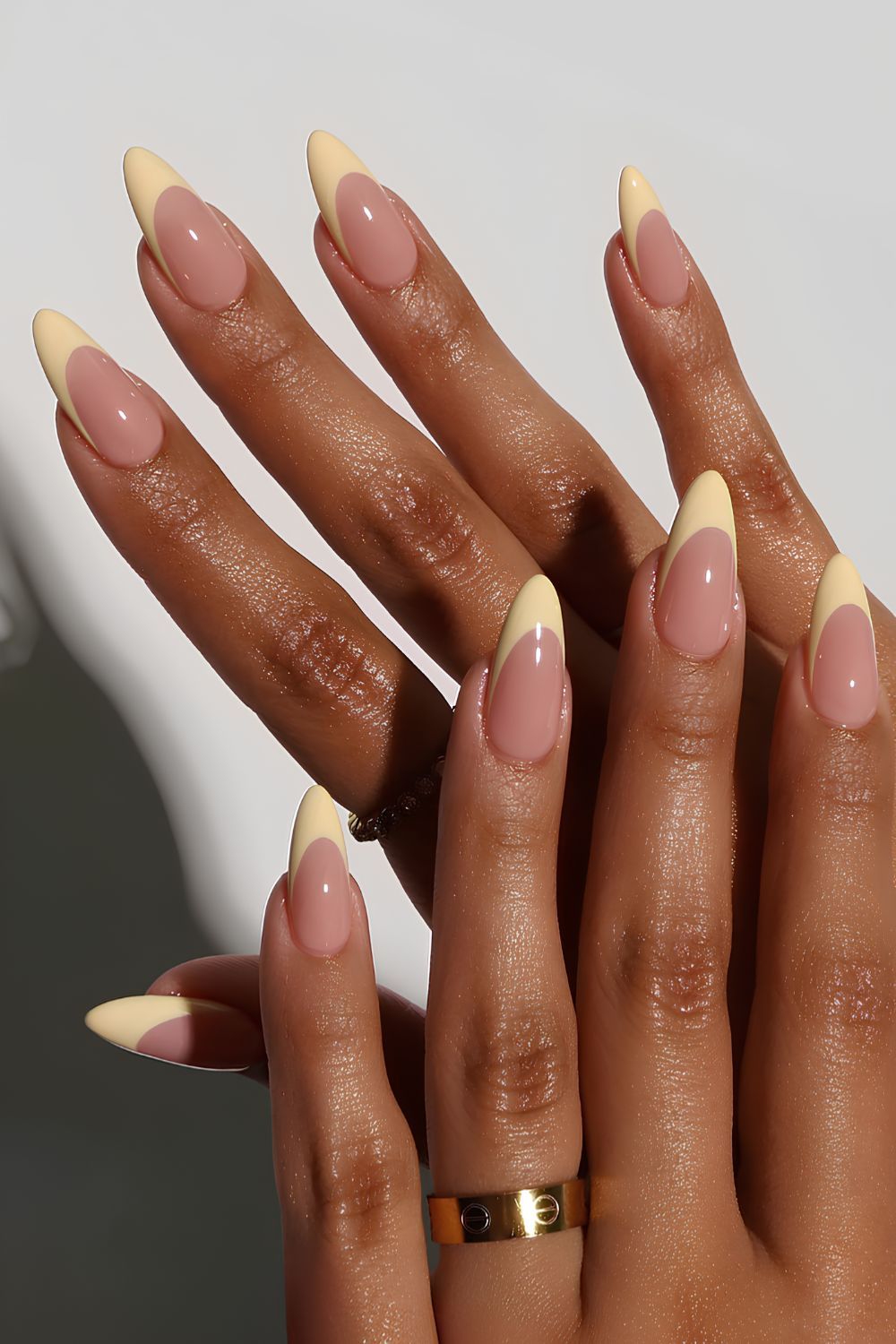
Creamy Latte / Oat Milk Neutral
A warm, cushioned neutral reminiscent of café foam or oat milk. It’s cozy but polished, ideal for pairing with blankets, scarves, and textured knits. This tone flatters many skin tones without screaming “nude.” Because it isn’t purely pale or stark, it reads as high-end and intentional — an elevated neutral you can wear every day.
Lavender Frost
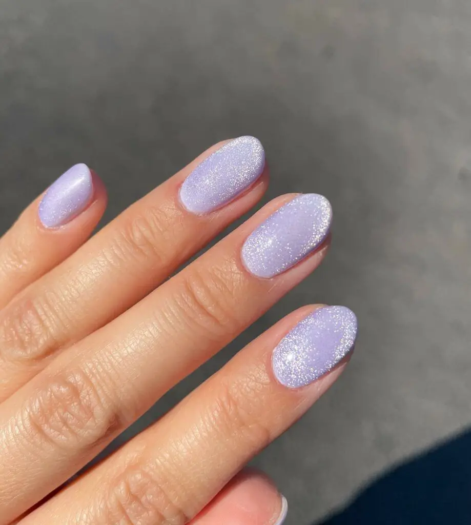
A pastel purple kissed by winter’s light: soft, airy with a frosty shimmer. It captures a fairytale coolness without venturing into childish pastels. The frost or pearl finish adds luminosity, making nails glow in indirect light. It’s ideal for those who love color but want something soft for everyday wear.
AD PLACEMENT
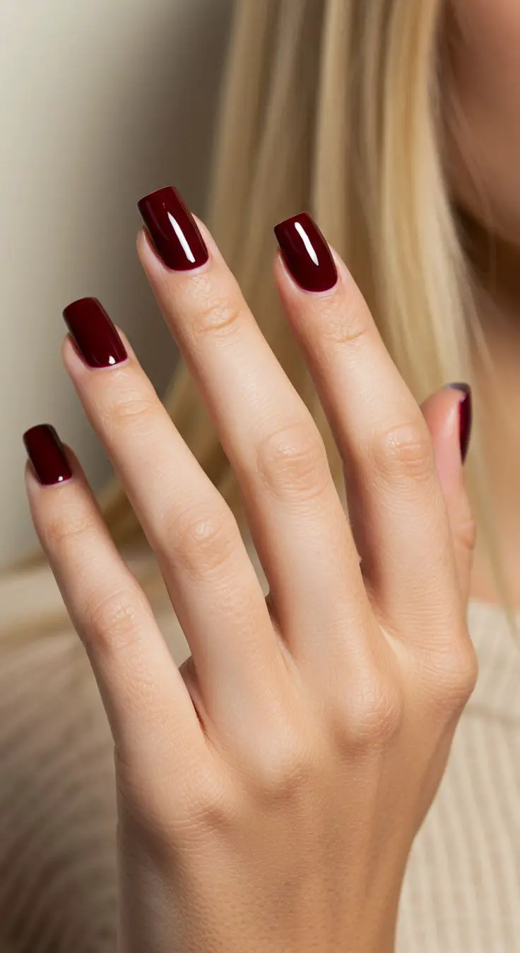
Deep Cherry Red (Jewel Merlot)
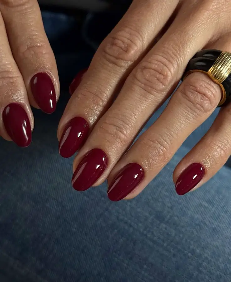
An elegant, moody red with plum or berry undertones that shift with light. This shade is rich and opulent, acting as a winter “neutral” that still commands attention. With just the right balance of red and dark tones, it evokes wine in candlelit dinners or luxurious evenings. A glossy top coat amplifies its depth and makes it feel expensive.
Smoky Grey-Blue
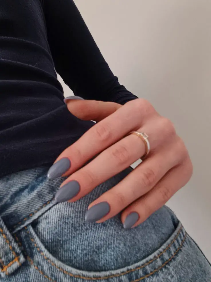
A stormy, muted blue tinged with grey — think slate under winter skies. This shade feels modern, cool, and versatile. It’s an excellent alternative to black or navy when you want something dramatic yet subtle. Use in shine or half-matte finishes for an edge that reads elegant, not heavy.
Also Read: Red Shoes Are the Move This Summer — Here Are 27 Outfits to Prove It (From Sneaks To Flats)
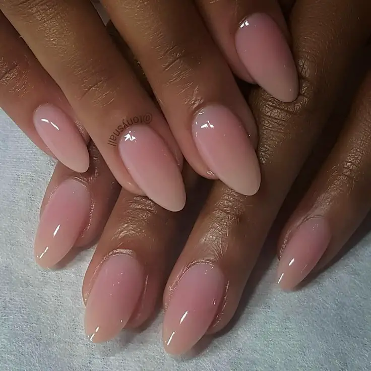
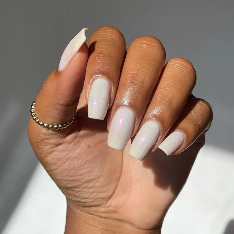
Bare / Soap Nails (Sheer Milky Wash)
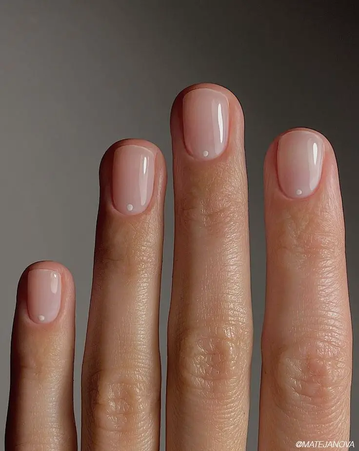
Minimalism meets polish: sheer, pearly, “just-there” tones that let your natural nail shine through. This subtle approach softens even bold outfits and adds a quiet, refined elegance to your look. The goal is healthy, luminous nails — a whisper of color that feels polished but not flashy. You can build it up or keep it ultra-soft depending on your mood.
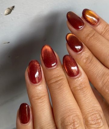
Burnished Copper / Rusty Bronze
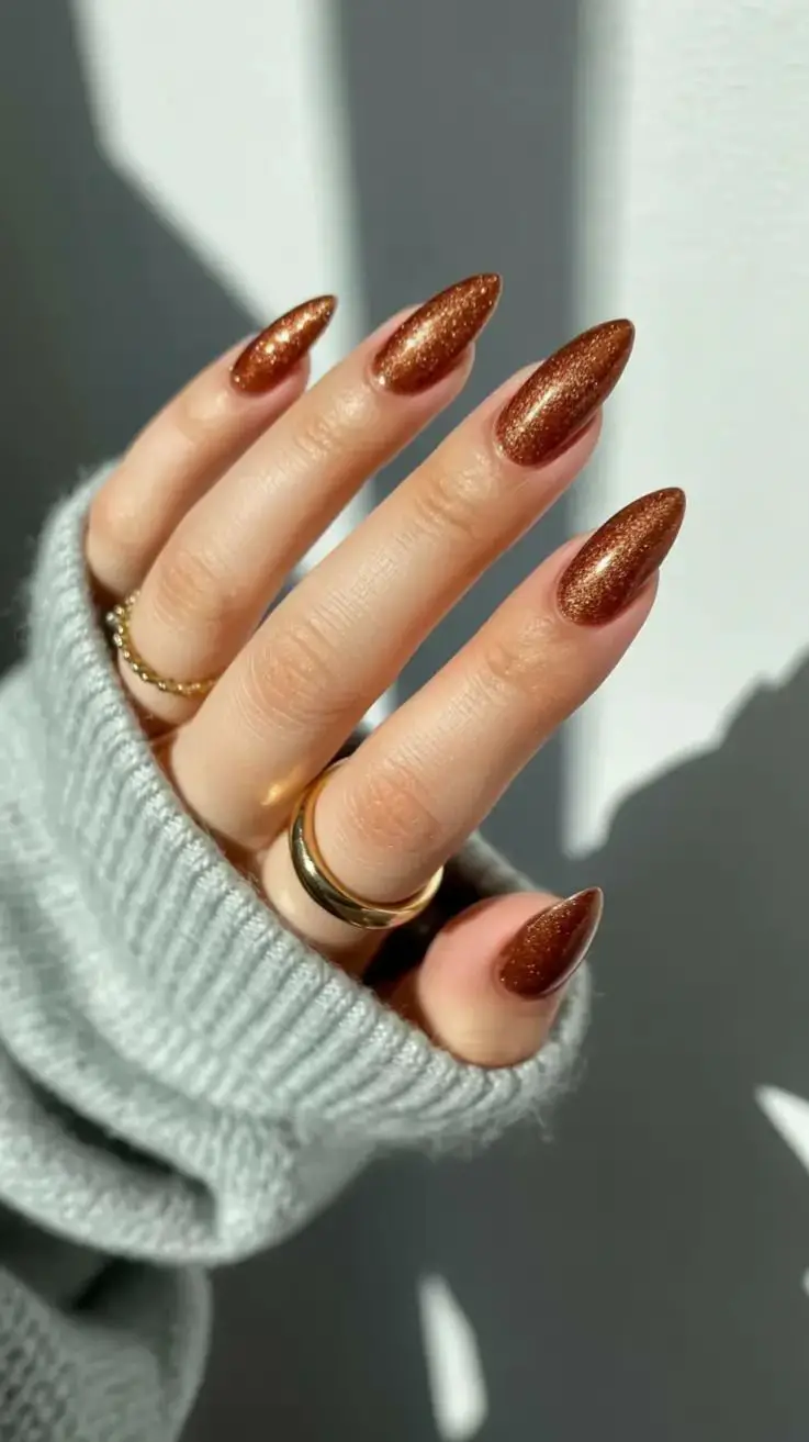
Warm metallics grounded in bronze, terracotta, or rust tones. This shade bridges fall and winter — rich, cozy, and autumnal but with a glow that suits cold nights. Use in subtle shimmer form rather than full foil, so the glow feels warm, not harsh. It pairs beautifully with leather, tweed, and bronze accessories.
Forest Green / Deep Sage
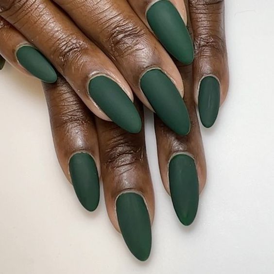
A moody green tinted with forest shadows or soft sage. This hue embraces nature’s calm and depth, giving a grounded vibe to your manicure. It reads dramatic without being dark and pairs especially well with neutrals, camel, or charcoal tones. A satin or creamy finish works best to retain richness.
Velvet / Suede Finish (Soft Matte Tones)
Soft matte jewel or neutral shades with a velvety finish give a luxurious tactile vibe. They feel cozy as cashmere yet rich in pigment. Because the finish absorbs light, colors like deep burgundy, forest green, or mocha gray read deeper, plush, and dreamy. They evoke winter textures while staying modern.
Taupe / Mushroom Neutrals
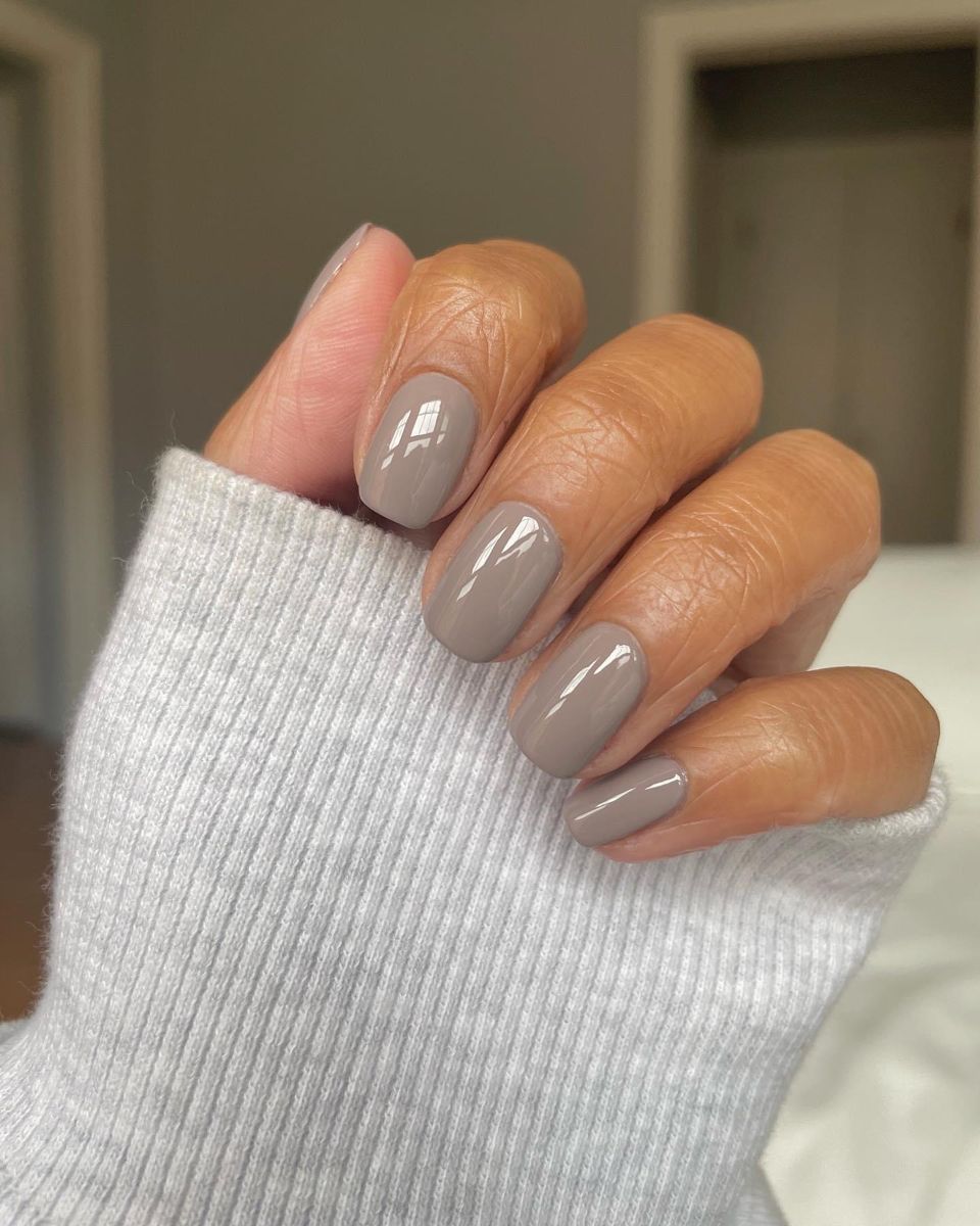
A grounded, earthy neutral between beige and gray — think mushroom or taupe tones. It feels mature, sophisticated, and understated. Because it isn’t pink-based, it leans modern and doesn’t wash out complexions. Use matte or satin variants to give it a refined touch that quietly complements bold winter attire.
Ruby Wine / Cranberry
A crisp, wintry red toned toward cranberry and ruby, rather than pure red. This shade is festive but still wearable. It bridges the gap between bright reds and deep cherries. With a glossy or jelly finish, it gives you a vibrant edge without feeling over-the-top.
Glazed Amber Nails
This is the “glazed donut” effect but evolved: ultra-shiny, smooth, and slightly see-through. The color seems suspended beneath a glossy surface, like glass. Use delicate tints — e.g. rose, icy green, pale amber — so the polish doesn’t read opaque. The high gloss finish gives polish an elevated, premium feel.
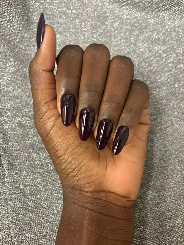
Wine Night / Jammy Plum
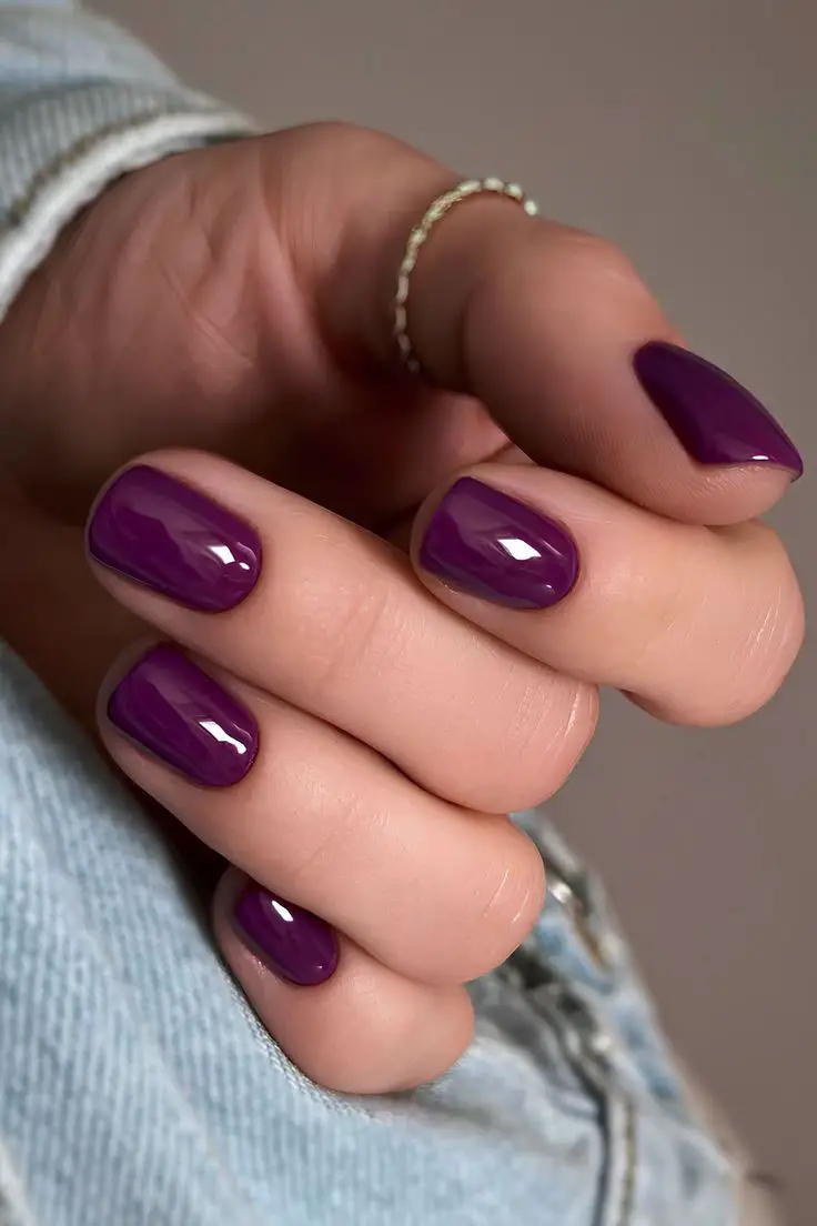
A deep, saturated plum or wine shade that reads lush and moody. The color is vibrant but dark, evoking berry compotes and winter gardens. It’s polished and dramatic without being gothic, perfect for nights out or day-to-night looks. A high-gloss finish or a touch of shimmer makes it pop beautifully.
Butter Yellow Pastel
This soft, buttery yellow shade glows gently like buttercream in sunshine. It’s unexpected for winter, but in its pastel form, it reads gentle and modern. Use as an accent or full-tone layer with opaque coverage to avoid looking too springy. This sunny touch can brighten moody outfits without clashing.
Mocha Cocoa Brown
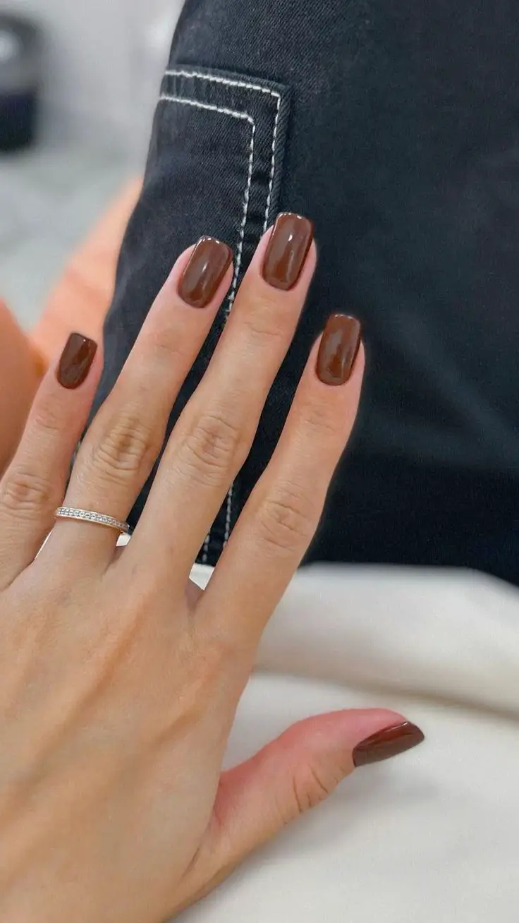
Deep, chocolaty brown with smooth, creamy undertones. This shade is rich and grounding, offering a stylish alternative to black. Because brown is getting its moment, this tone feels fresh yet cozy — perfect for winter layering. Use in glossy or satin finishes to emphasize its depth and warmth.
Blue Noir / Ink Navy
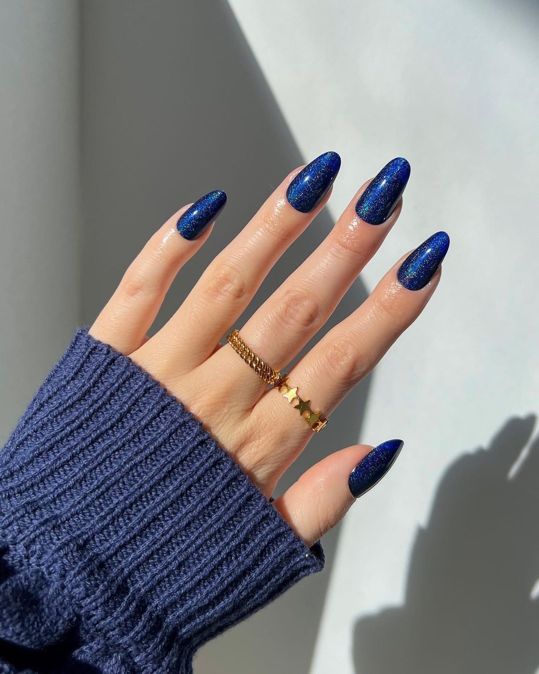
A nearly-black navy that reads deep under low light, but reveals its blue heart under brighter light. This shade is strict yet elegant — sharper than black, subtler than navy. Use it as a moody base or accent. The blue undertone gives it dimension, especially in shine.
Mauve Greige
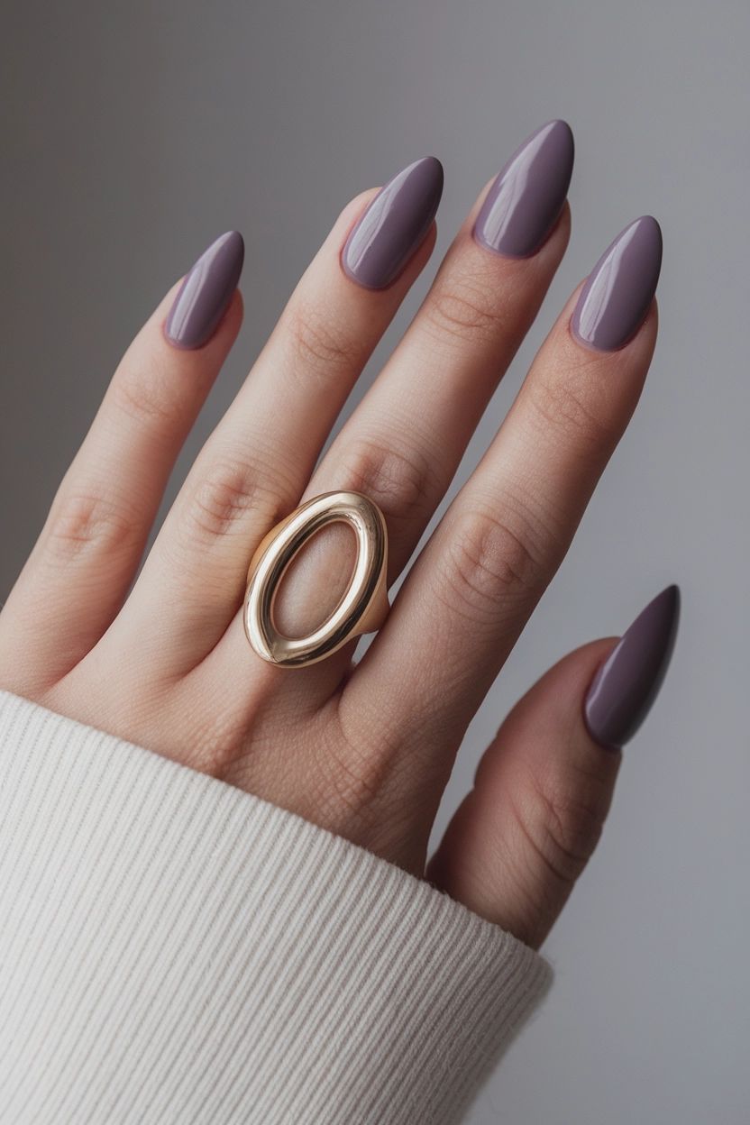
A soft hybrid between mauve and greige — muted, cool, and slightly dusty. It balances warm and cool tones, making it super flattering on many skin types. This is a “quiet luxury” color that feels modern but soft. You can wear it as your staple winter neutral or as a base for minimalist designs.
Stone Cold
A color-shifting shade that plays between soft pearlescent tones — pink, green, lavender — depending on the light. This finish lifts any base shade into something dreamy and dynamic. Use it as a top layer over neutral bases or let it shine alone for a magical, multi-dimensional effect.
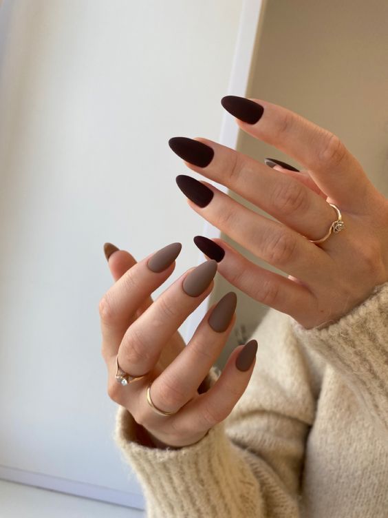
Charred Plum / Blackened Berry
A shadowy berry tone flirting with black. Think dark plum dipped in ebony. It’s dramatic, mysterious, and perfect for the bold minimalist. This color feels both rich and sleek. A glossy top coat brings out depth; a matte finish lets it read more noir and edgy.
AD PLACEMENT
You might also like
AD PLACEMENT